A habit loop that doubled trial conversion
Free-trial → membership conversion went from 11% to 22%, monthly check-ins rose 19%, and one-month retention climbed from 49% to 64%. I designed the loop behind those numbers for Letswork (a trial goal, a routine members set themselves, and a three-month journey), and read the impact straight out of the product analytics.
- Role
- Product Design
- Product
- letswork.com
- Timeline
- 1–2 weeks
- Focus
- Trial churn, retention, habit formation
 Omar AlMheiriFounder & CPO
 Suhaib AhmedEngineering Lead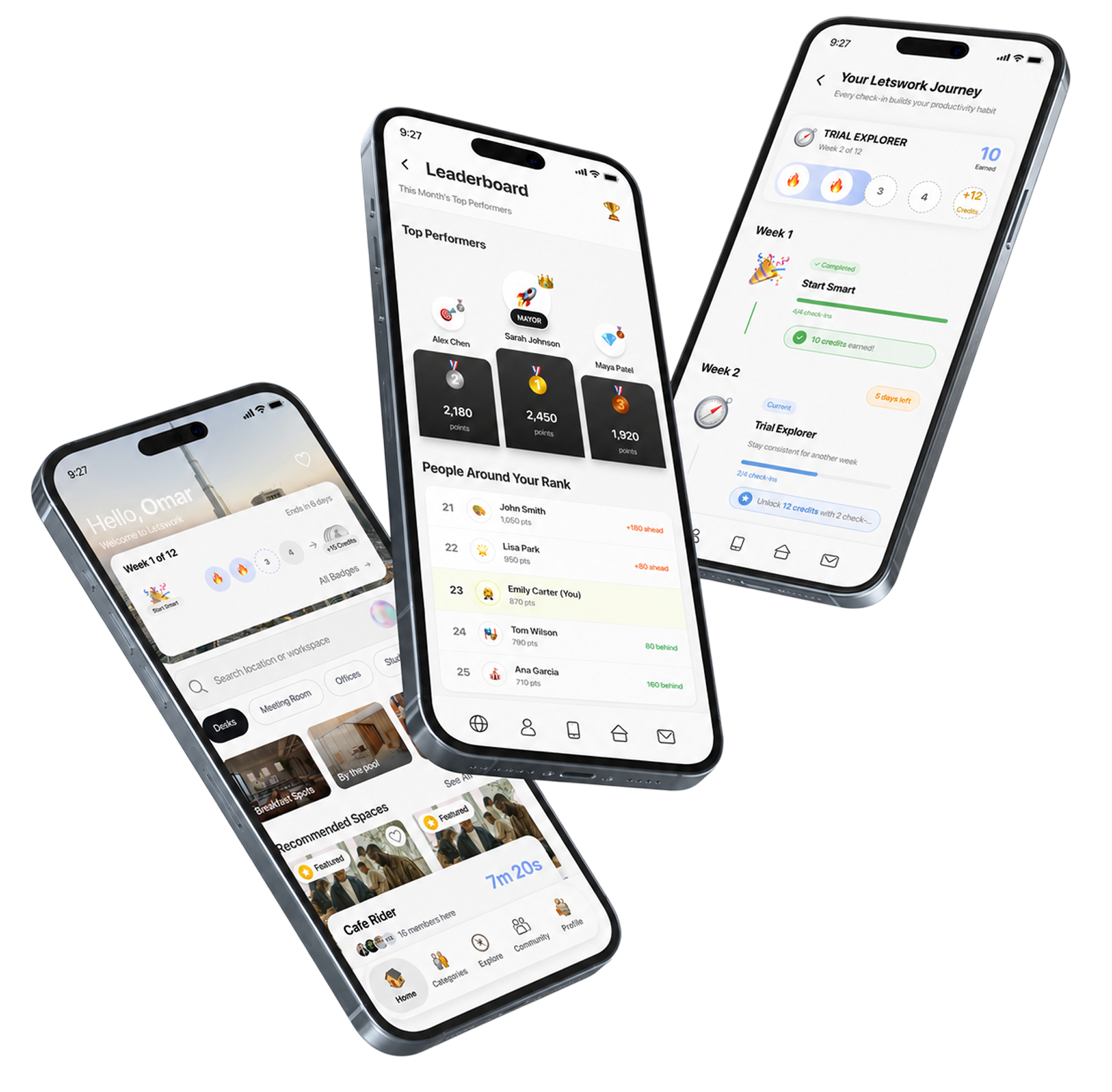
The short version: Letswork sells a subscription to a network of workspaces. Trial users were arriving, checking in once, and disappearing. I designed a three-act habit loop: a trial goal sized to be winnable, a productivity routine the member sets themselves, and a twelve-week journey generated from that answer. It moved trial conversion, retention and churn, and produced one result nobody designed for: people started subscribing before the trial was over.
Letswork is a flexible-workspace network spanning 44 countries across the Middle East, Pakistan and Europe, closer to ClassPass than to a landlord. Members hold a subscription and spend credits to check into third-party venues: cafés, coworking floors, hotel lounges, studios.
Credits are the only variable in the business. Every plan carries the same perks, you’re only choosing how many you get each month. So the whole company rests on one behaviour: does working somewhere else become a routine, or stay a novelty?
I owned the loop: the mechanics, the flows, the interaction craft and the working prototype the build was specced from, alongside Omar (founder, CPO) and Suhaib (engineering lead). Brief to shipped loop took one to two weeks. I designed in Figma, built a running prototype with Claude Code and staged it on Vercel, so reviews argued about a real product on a real phone.




The free trial worked right up until the moment it mattered. People signed up. People checked in. Once. Then the trial ran down and quietly expired, and someone who had already had a good experience never came back for a second one.
That distinction is the whole brief. Not a satisfaction problem, not a pricing problem, and no amount of polish on the check-in flow would have touched it. It was an absence: the product had no opinion about what you should do next, so most people did nothing.
I audited the home a trial user lands on and the whole path that got them there. Neither was broken. Both were silent.
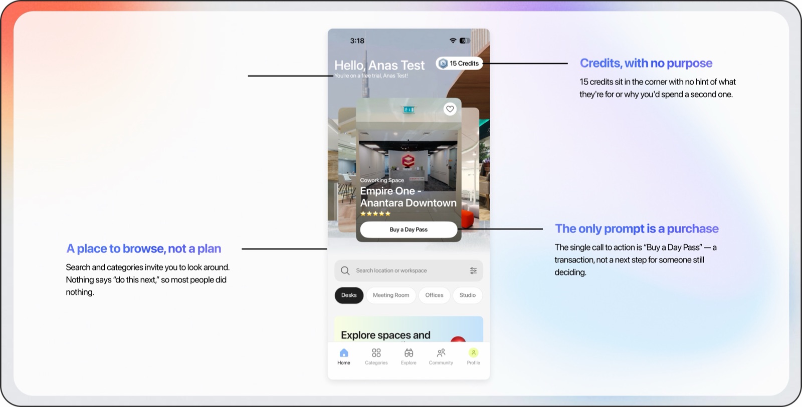
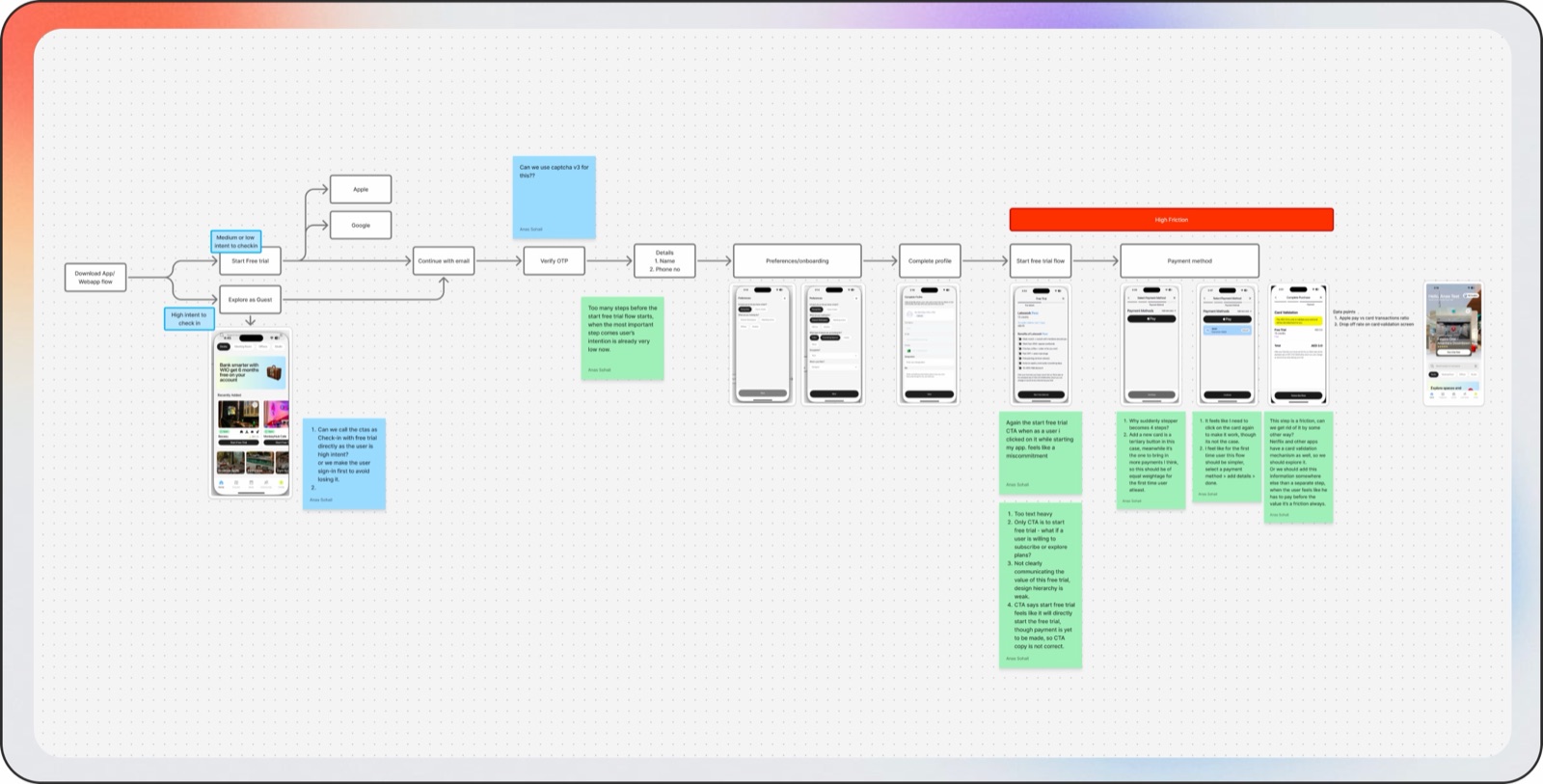
The instinct here is to reach for notifications. We didn’t. A reminder tells you to do something. It doesn’t give you a reason.
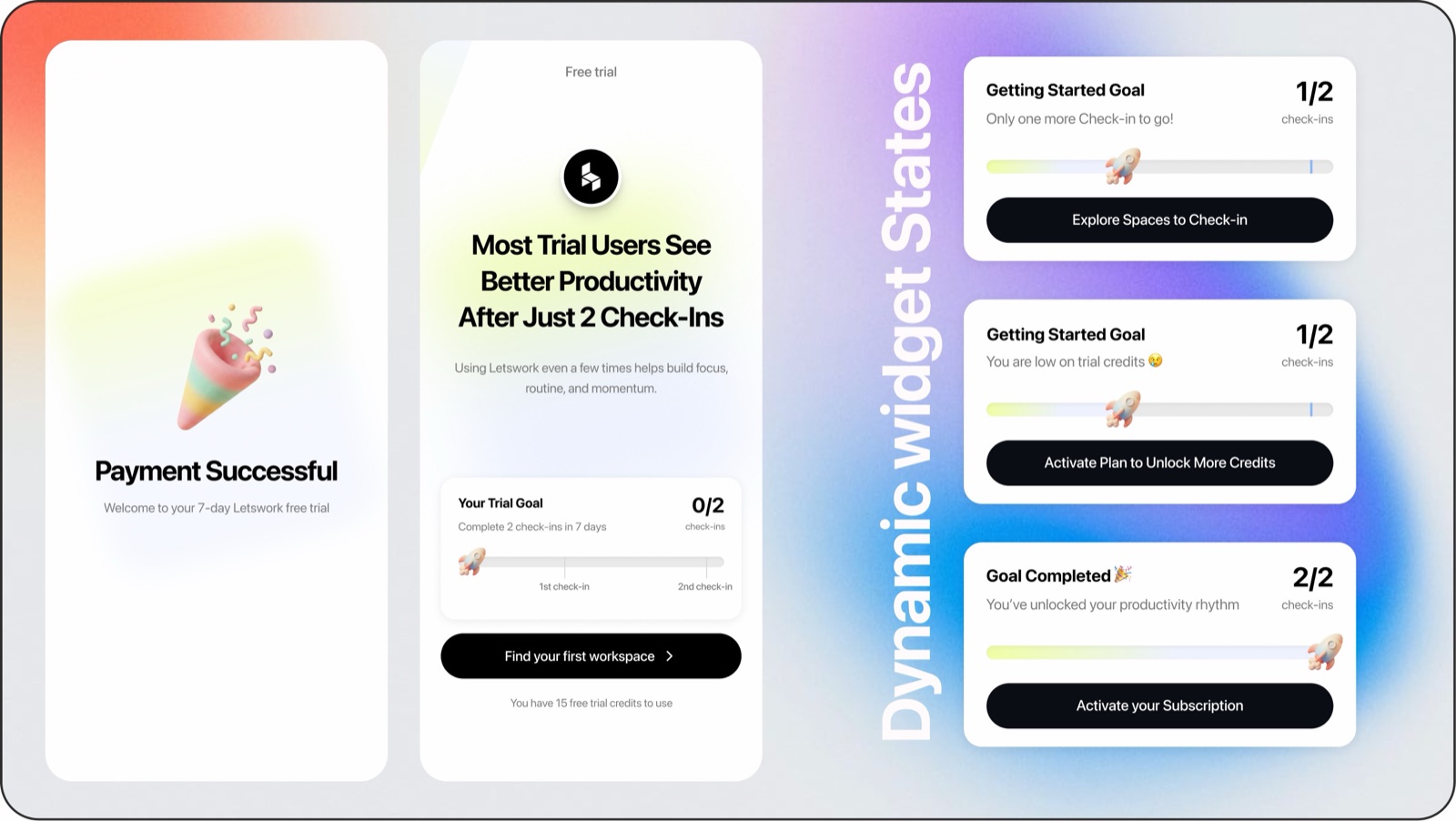
So I gave the trial a shape: a small, explicit goal visible from the home screen, and, critically, one you could actually finish with the credits you’d been given. Once it was met the loop widened into a routine you set yourself and a three-month journey generated from it. Three acts, one repeated action.
Gamification goes wrong when it starts working against the person inside it, so before designing a single mechanic I wrote the guard-rails every rule had to pass.
Would I still be comfortable with this rule if the member could read the source code?
- Never take away progress someone earned
- Never set a goal the product makes impossible to reach
- Never pay a reward before it's been earned
- Never make the exit harder than the entrance
Act one, a goal you can win. On sign-up the interface reorganised around one target: a dynamic number of check-ins, sized against the credits the user actually had. A goal you can’t reach on your trial credits isn’t motivation, it’s a paywall wearing a progress bar.
A trial goal small enough to finish inside the free credits, so a trial user has a reason to make a second check-in.
I designed the goal to drive a second visit. The early-activation pattern fell out of the credit maths on its own, and turned a retention mechanic into an acquisition one.
Scroll →
That sizing produced the result I didn’t plan. Someone with 15 credits checks in at a 10-credit space and likes it. To finish the goal they need one more check-in, and the space they want is the one they already know. Five credits won’t cover it. So they subscribed, during the trial.
Act two, a routine they write themselves. Once the goal was done we asked one question: how many days a week do you work remotely? Say three and the product builds around three, setting the weekly target and defining what counts as a good week for you. Nobody argues with a target they set themselves.
The widget it feeds is the piece I’d defend hardest. Almost every habit product scores the past: streaks, calendars, red marks. Showing the upcoming days turns a report card into a reminder, and it arrives while you can still act on it.
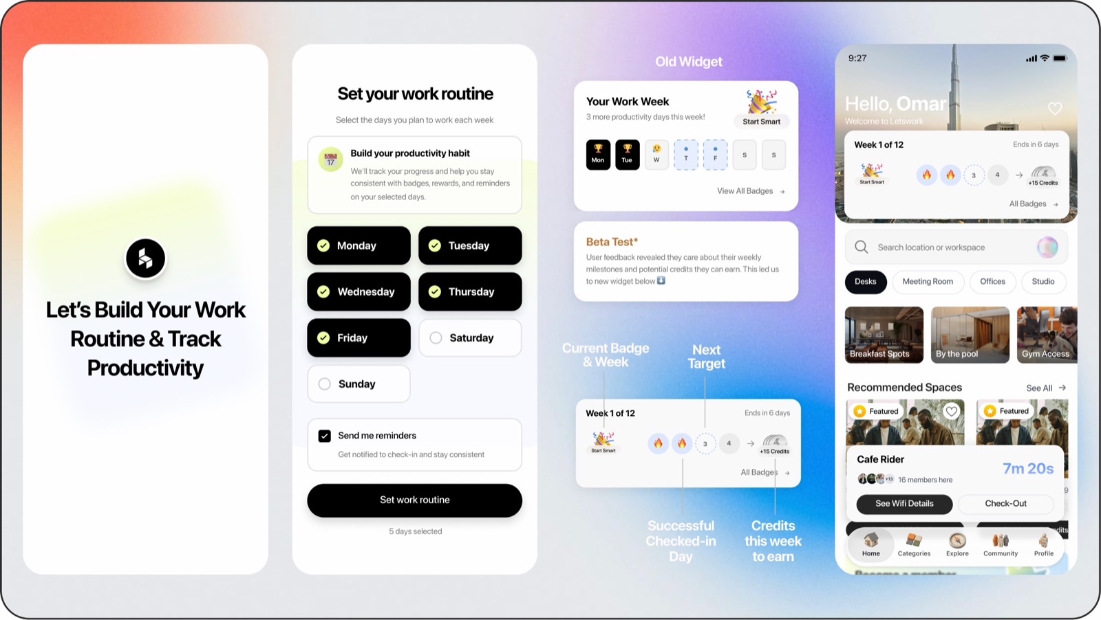
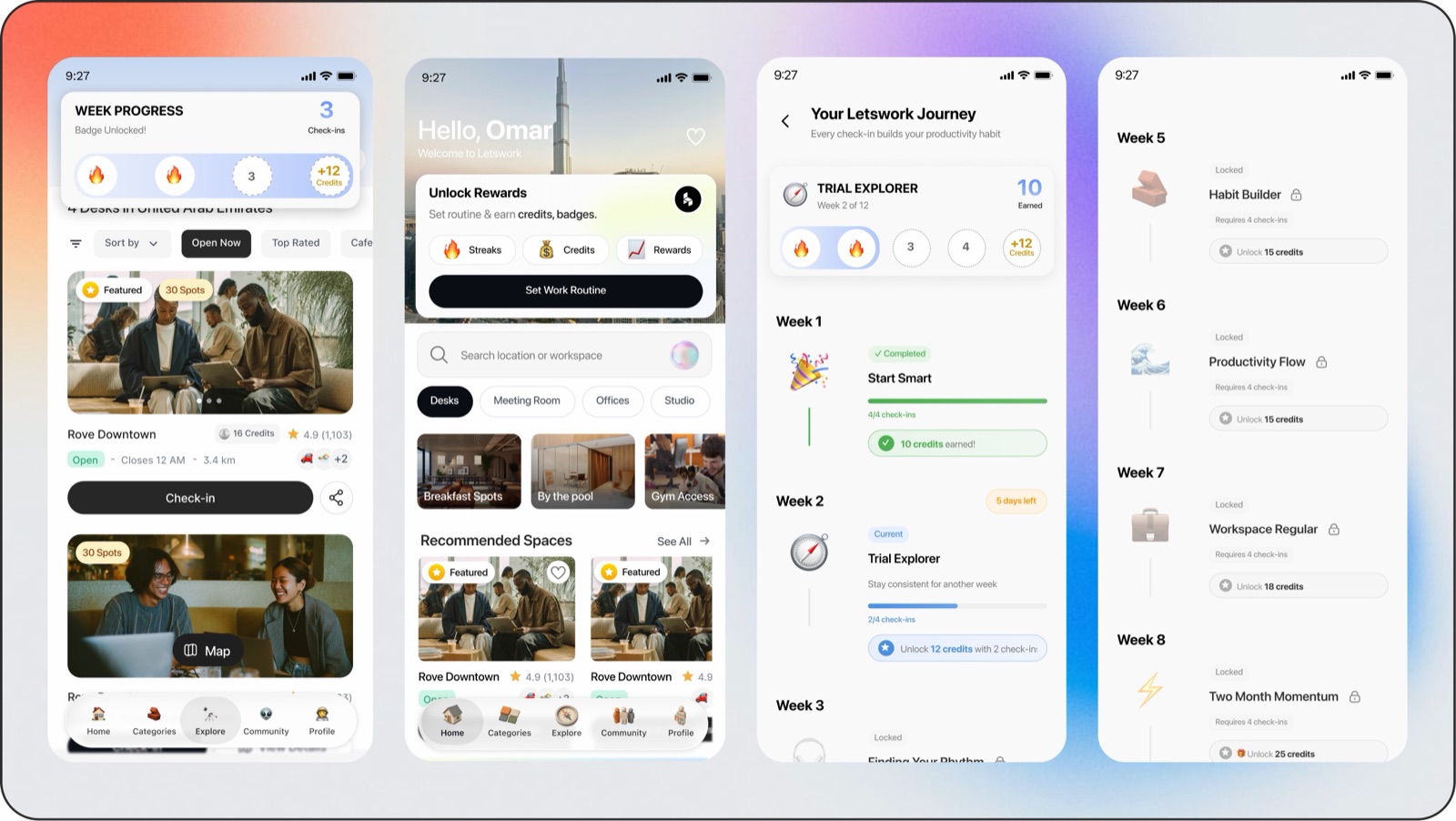
Act three, a twelve-week journey. Four check-ins a week unlocks a named badge and pays credits back into the wallet, not points. The reward for building the habit is more of the thing the habit is made of, so the loop funds itself and every badge has a spendable value.
The payout curve isn’t linear. Every fourth week closes a month and pays roughly double, 20, 25, then 50 at the finish. Months are the unit a subscriber actually feels, so the reward peaks exactly where the renewal decision lands.
The clearest evidence didn’t arrive in a dashboard. It arrived in a support chat.
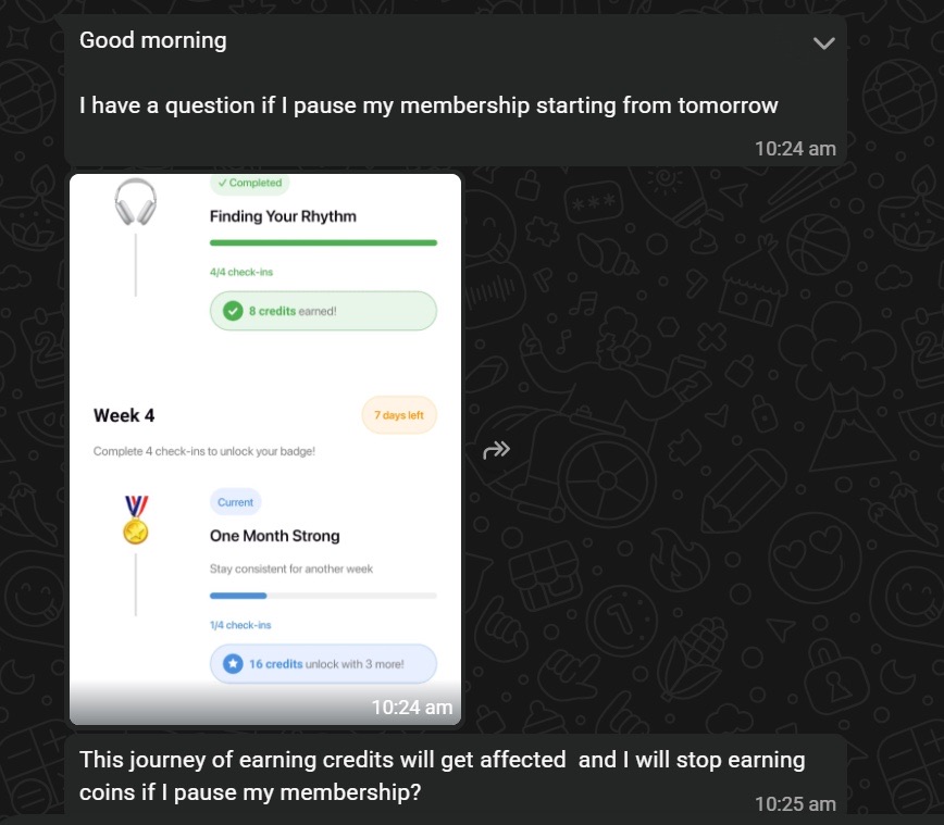
Nobody asked them this. They opened a support chat, screenshotted their own progress, and checked what pausing would cost, three weeks into a twelve-week journey, one check-in into the month. That is a switching cost, in a member’s own words.
Three weeks earlier this person would have paused without a second thought. Now pausing had a price, and they wanted to know what it was before they paid it. We didn’t reduce cancellations by making it harder to leave. We reduced them by giving people something they’d built and didn’t want to abandon.
Trial conversion doubled. Before the loop, roughly one in nine trial users bought a membership. After, closer to one in five. The habit got denser: active members checked in about 19% more often. And they stuck around: of members who checked in one month, the share returning the next rose from 49% to 64%, holding across following months. That last one matters most, because retention is the engine of lifetime value.
The result I keep coming back to isn’t on the table though. Early activation, trial users subscribing before their trial ended, wasn’t a goal or a line in any brief. It fell out of the credit arithmetic of a mechanic built for something else, and it’s the clearest evidence the loop was tuned to how the business actually works.
The lesson I keep is that the nudge has to arrive before the miss. The trial goal, the routine that shows the days still ahead of you rather than the ones you missed, the badge that pays out before the renewal decision, all the same idea: reach people while they can still act.
What I’d do differently: I sized the trial goal against the plan and shipped it. I’d rather have tested a couple of goal sizes against each other and let the drop-off curve pick the winner, instead of reading whether it worked only afterwards.
Thanks for reading.
If you made it this far, we’d probably enjoy building something together.